The following page shows the results of the German Bundesliga predictions. The same plots are available here for the Swiss Super League.
- What is the range of a team's final position?
- Who are the favourites and underdogs in each game of the upcoming round?
- What is the most likely final table of the season?
- Which teams are the positive and negative surprises of the season so far?
We give a brief explanation of how the predictions are calculated and provide more details in the further explanations section. We also present interesting further analysis and assess the forecast quality.
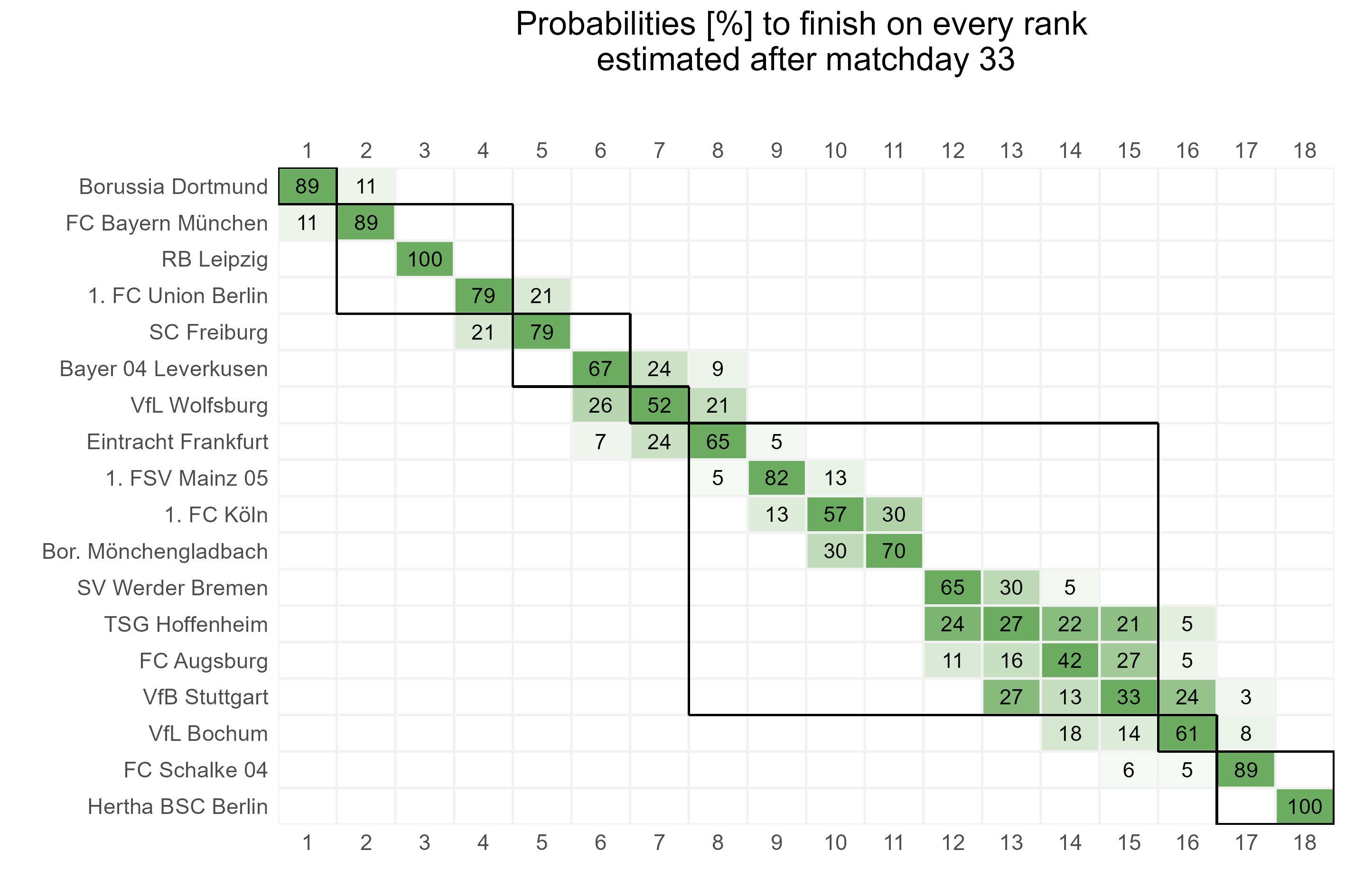
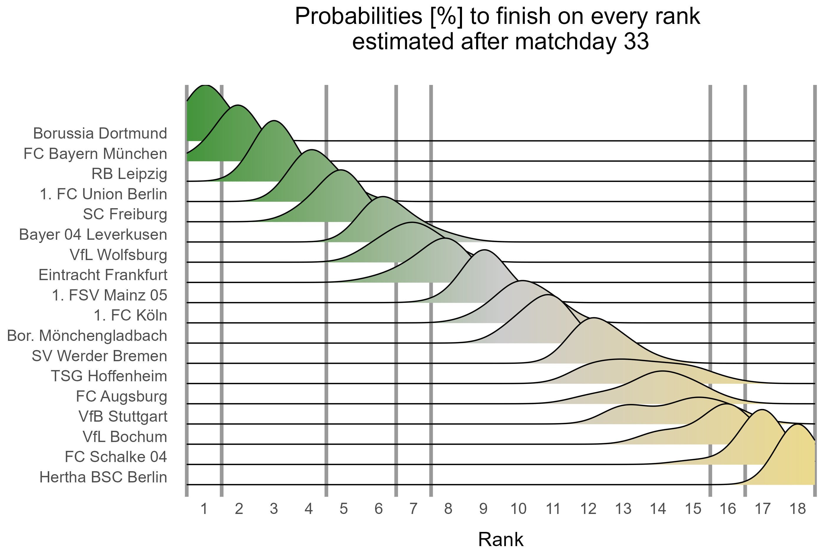
The table below shows how likely every team finishes on a certain rank. To calculate these probabilities, we simulate many thousands of different seasons by a computer program based on our prediction model. If you want to know how, please read our further explanations. The chart shows how often each team finished in each position at the end of the simulated seasons. In further analyses, we illustrate these numbers and the evolution of the expected points in the remaining season in an interactive dashboard.
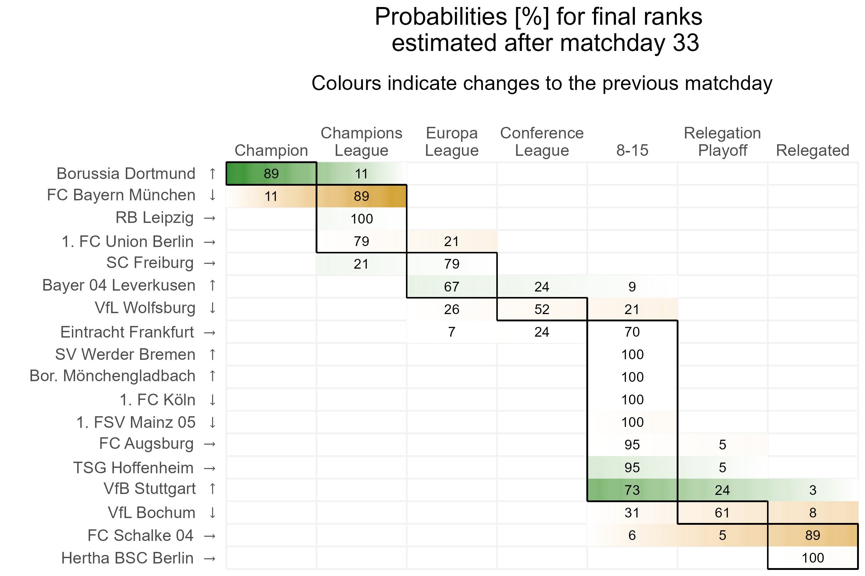
The following heatmap displays the changes in probabilities to achieve distinct areas in the ranking after the latest matchday. Grid elements colored in blue indicates that the probability has risen for a team to finish in the corresponding season-goal, while orange dyed elements stand for a decrease in probability.
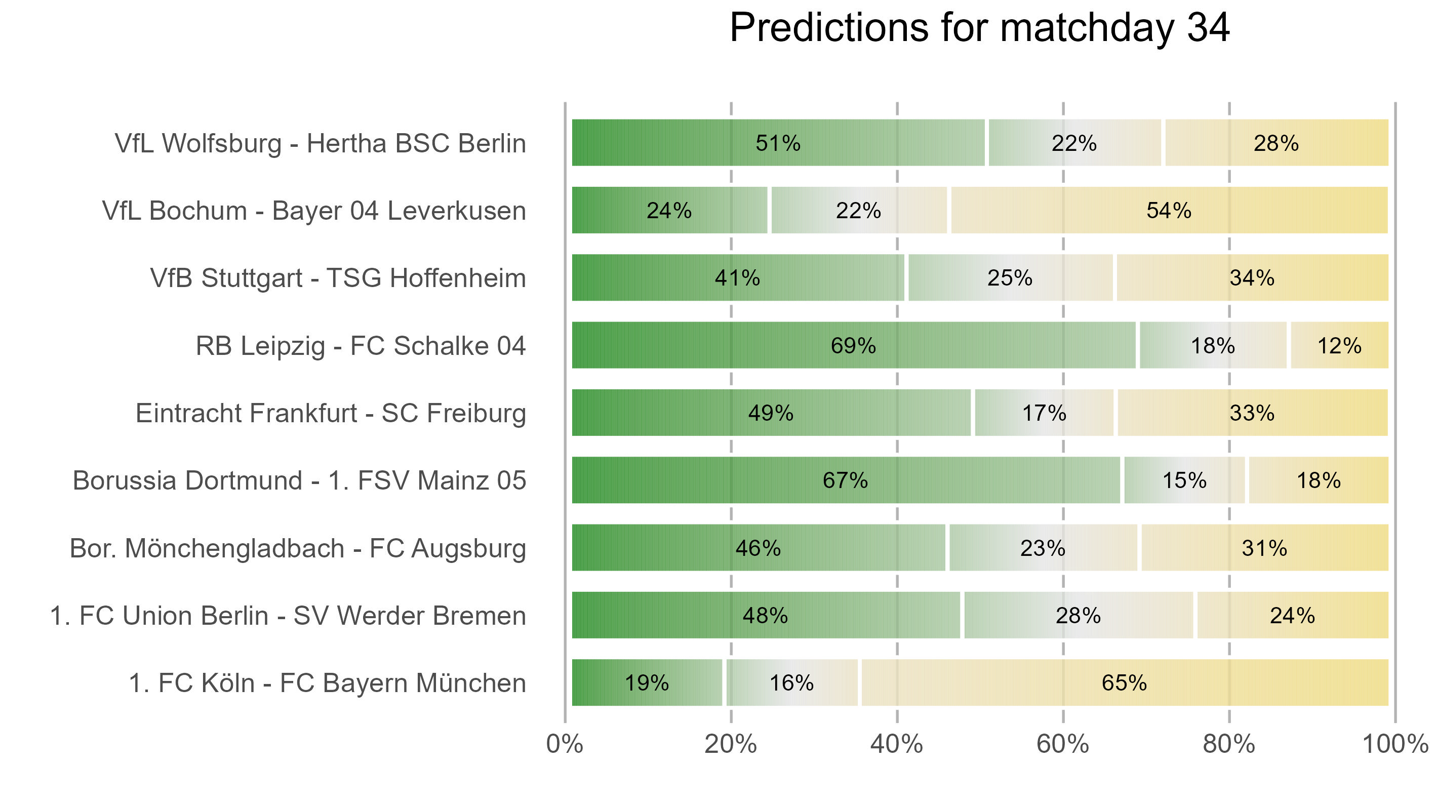
Here, fans can check the probabilities according to which their team wins, looses or draws in the next round.
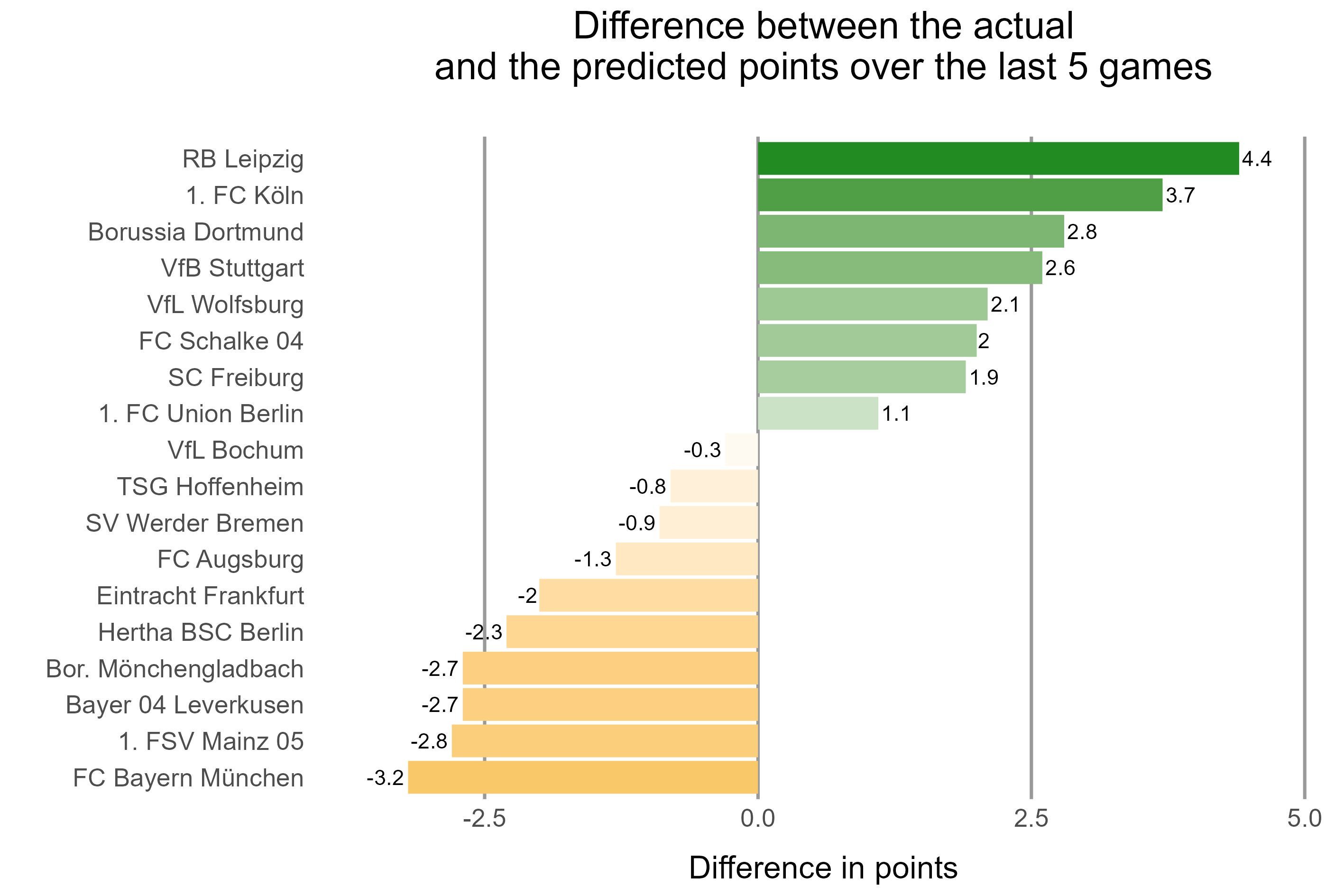
The next graph shows the current form of the teams over the five most recent games. A positive difference (green) between the achieved points and the predicted points indicates a good form. Teams with a negative, red difference have won less points over the last games as predicted before the season started.
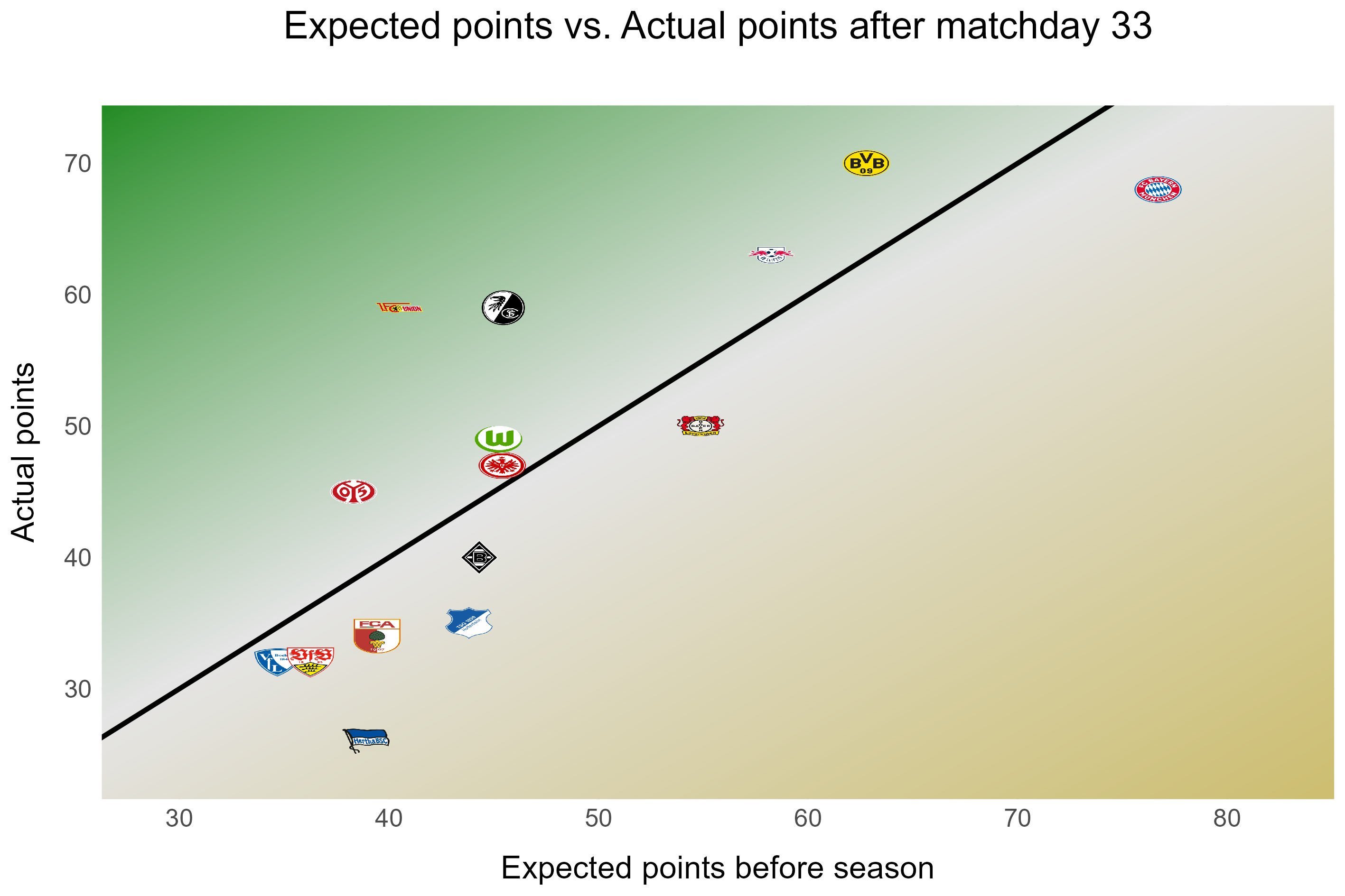
The graph below shows for each team whether its achievements so far are above (green) or below (orange) the expectations before the season. Teams located on the diagonal line have so far achieved exact the same number of points as predicted at the beginning of the season. The more a team deviates form the diagonal the larger is the difference of its actual points to the forecasted points before the season.
In this plot we show the currently estimated probabilities for the ranking at the end of the season, displayed as the empirical probability density function. The higher the curve over a rank, the more likely this rank is for a particular team.
Additionally to team performance, we consider the performance of the coaches in the current season or since taking office. To this end, we calculate the deviations from the forecast on a normalized per match day basis. While coaches are save with green bars, red bars indicate hot seats. The yellow bars suggest increased danger for the coaches.
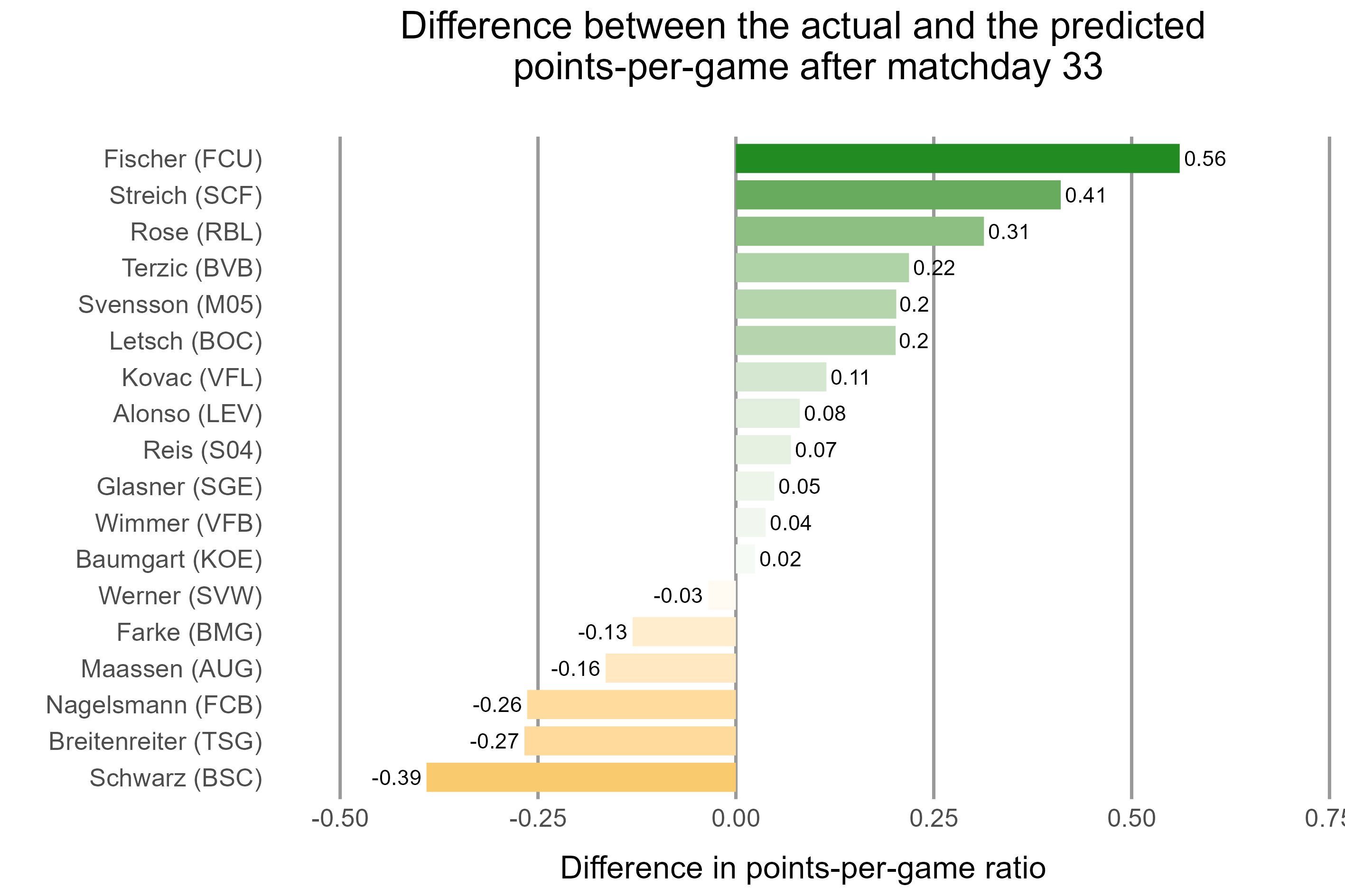
Coaches with less than three games are not displayed.